bathymetric /ba-thi-ˈme-trik/ of or relating to measurements of the depths of oceans or lakes
What's this all about? ...Here's an introduction to this blog and here's a 30-second overview of the book itself

Thursday, May 31, 2018

One great thing about this project is that it has no deadline. It's also a terrible thing.

I am still here. I still want to complete this project.

There has been progress since 2016! I have 17 blog posts in draft form (for comparison, only 18 posts have been published here since 2013). The project is at a stage where it's hard to organize thoughts and decide what to do next.

Sector67 is moving to a new building, which we are renovating extensively. I have occasionally been helping with the construction. Sector deserves none of the blame for this project's hiatus however-- that's all me.


Monday, December 19, 2016

Line Generalization

A few months ago, I did some line generalization in Adobe Illustrator to improve the alignment and appearance of the laser-cut contours.

I started with the (Object - Path -) Simplify tool to reduce the number of points.
Then I manually adjusted linework to disentangle areas where the lines are too close together or have odd angles. I also looked over the previous laser cuts to eliminate tiny projecting pieces and to detach parts that were hanging on by a thread.

Here are a few examples of the simplified linework:
Linework prior to simplification
Original linework in pink, with generalized linework in black.


Original linework in pink, with generalized linework in black.


Thursday, July 28, 2016

Book cloth samples

After looking at several cloth samples from different suppliers, I recently requested two samples of Japanese book cloth from the Campbell-Logan Bindery in Minneapolis. 

Cloth 541-01 is a bright silver with slightly raised streaks in its texture. 

Cloth 361-B is a medium grey with just the faintest deep blue mottling. It feels thin, flat and smooth, yet slightly soft to the touch. Viewed at an angle, it's shiny- almost metallic. 


After receiving the physical samples, I'm really drawn to cloth 361-B for this project.  It has just enough variation in color to make it neither too flat nor too noticeable. I think the fine, smooth texture of the cloth will compliment the sleek laser cuts, unlike the linen that I tried earlier


Cloth 361-B also has a hint of distant-mountains blue that fits well with the colors of the landscape of Crater Lake. 


Here's the cloth sample next to a test laser cut: 


I will probably order either 5 yards (about $100) or 10 yards (just under $150) of material for testing. Then I'll work on a pattern for wrapping the cloth around the book board, a method of anchoring the sewing to the cover, and other details of cover construction. 


Thursday, June 9, 2016

Prototype 2, April 2016

This April, I've been building a new prototype and inching closer to my ideal. I've been trying out materials, refining the structure, and improving the production method.
This has been a slow, iterative process.

I've been "auditioning" paper and cloth to find just the right materials.


Here's what it could potentially look like without any color:


Production: 

Laser-cutting the book board went well, although it does produce a lot of soot on the edges.


I cut strips of flat magnetic sheet (sold as vent covers) to hold large sheets of paper down on the laser bed- a significant improvement from previous trials, when the paper would easily lift up and ruin the cuts:


A curved needle makes it easier to sew a coptic binding:


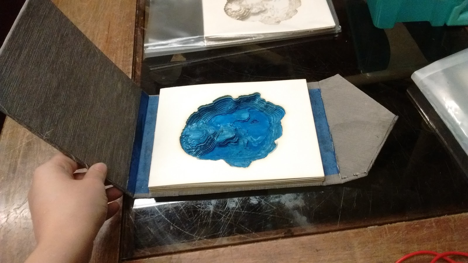
I developed a process for cutting and assembling the Merriam Cone feature, a stack of concentric circles that need to be glued into one unit. I leave about 1 mm of their outline uncut so I don't lose the tiny pieces through the laser cutter bed. I then stack them on a jig built with two sewing needles to align the first 10 pieces. The final 2 layers cover the holes.


Structure: 

I am happy with the binding and the shape of the case (hard cover), but many structure-related questions linger. I'm still working out how to...

- embed the magnets in the cover
- secure the sewing to the cover
- fold the cloth around the cover


My goals still look very similar to what I was working on in late 2013. Progress is slow, but I'll keep at it!


Wednesday, May 4, 2016

Tesla Gets Curious

The Sector67 makerspace cat wants to know what's going on... 


Or maybe it's just a warm place to sit...

Monday, April 11, 2016

Prototype progress, Oct 2015

Last October, in preparation for NACIS 2015, I began to search for the materials to use in the final edition. My original prototype was built entirely with scrap material. I tried a new paper, a cloth for the book cover, and a paper to line the cover.

My first tests on the laser cutter used a Canson drawing paper that I happened to have lying around. I bought a heavyweight watercolor paper to test, and noticed two unforeseen problems with the result. First, the laser cuts caused a more significant yellowing of the watercolor paper. Second, the paper has a distinct texture on each side, which is visible as it alternates from page to page due to my book's structure. I found the alternating texture distracting and I wasn't happy with the yellow staining.

Testing laser cuts on a Strathmore cold press heavyweight watercolor paper 

Leaving those paper tests aside, I returned to the hard-cover prototype to try some new materials for the cover. The previous iteration of the prototype was simply covered in plain brown paper and had no lining.
I chose a grey linen cloth to cover the book. After actually trying this, I felt that the rough texture of the linen clashed with the sleek laser cuts. While I want my book cloth to have a varied texture, the linen wasn't quite right.

Grey linen
Re-covering the prototype in cloth

Finally, I tried a bright blue cardstock to line the cover of the book. Because Crater Lake is known for its vivid color, I really wanted to incorporate a bright blue into the design. After trying this out, however, I found that the cardstock's thickness impedes the hinges of the cover. Aesthetically, I also felt that the material was too flat and that its color drew attention away from the shape of the lake, which should be the visual focus.

Lining the prototype in a bright blue cardstock
Left to right: original, first prototype, second laser test

It was progress, though not in the way that I had hoped. Instead of finalizing some of my materials, I learned a bit more about what I really want, and I realized that selecting materials will be a significant challenge as I move forward.


Thursday, March 31, 2016

The Tangible Maps Exhibit at NACIS 2015

It has been a long hiatus, but I am returning to this project! In fact, there were some developments back in October of 2015 that I'm now catching up on blogging.

Thanks to my previous presentation at NACIS 2013, I was able to team up with fellow NACIS-ites Matt Dooley and Jake Coolidge to curate a special exhibit of tangible maps as part of the annual NACIS map gallery.

The exhibit is now documented in an article in Cartographic Perspectives as well as a dedicated blog.

My bathymetric book was featured alongside several other works. The exhibited maps were linked to the concept of tangibility in a variety of ways. Some, like mine, were meant to be touched by the map user. Other mapmakers highlighted the importance of touch in their design development or their production process.


One of my favorite pieces was Matt Dooley's beautiful "Ceramic," carved with a river network. One of these tiles now hangs on the wall in my home office!


Photo by Charles P. Rader
          
Photo by Dylan Moriarty


Megen Brittell, Amy Lobben, Megan Lawrence, and Manny Garcia's "Tactile Map Symbols across Three Media" was especially interesting. They conducted a study to compare materials for creating maps to be read by touch, like braille. I especially liked the microcapsule paper, which I had never encountered before. The microcapsule paper is first printed with regular ink, then heat-treated to create raised areas wherever ink has been printed. 

 Microcapsule paper. Photo by Charles P. Rader


The exhibit is documented in an article in the journal Cartographic Perspectives as well as a blog at http://tangiblemapexhibit.blogspot.com/


Photo by Dylan Moriarty

Photo by Dylan Moriarty